A Treat for the Eyes

 |
|
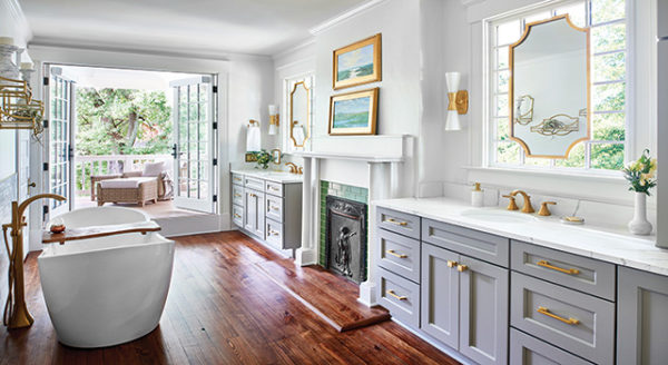
Photo courtesy of RLS Construction Inc. The freestanding tub adds charm and because it floats in the middle of the room, it avoids becoming a section along the wall. With towel shelves and floor racks, the bathroom maintains the clean look of days gone by. |
Suffering from tiny rooms for every purpose, this bathroom had one toilet in with the tub and another with the shower and, structurally, the floor system was uneven.
In order to add more natural light, warmth and style, the rooms were opened and a glass-door shower and an antique-style, freestanding, footed tub were added near the large square window.
This bathroom was taken from a cramped, confusing floor plan with busy ivy wallpaper, to a spacious room with neutral tones that cant overpower the senses. The result is the feeling of a picturesque villa found within the distressed cabinets, wall shelves and iron fixtures.
 |
|
Photo by Jan Stittleburg, courtesy of Lighter blue and pink granite in the shower and tub highlight the cherry cabinets. A cutout in the shower wall provides space for shampoo and is mimicked by the cherry window boxes on the wall above the tub. |
This little bathroom never knew what hit it. With the help of a spare bedroom/storage room, the houses one small bathroom was turned into a luxurious master bathroom and a half-bath/laundry room.
Removing the tub allowed the original space to house a toilet, sink and washer/dryer, while the new master bath was equipped with a whirlpool tub and full walk-in shower featuring natural granite surrounds.
The connecting wall is highlighted with two custom-built oak shelf units with dimmer-controlled, low voltage, recessed lighting. The shelves provide an ideal environment for the homeowners passion for growing orchids, says Donna Bourget of Bourget Innovations.
In the hallway, the custom linen armoire matches the vanity in the master bath. Polished nickel plumbing and cabinet hardware highlight the granite tile and oak flooring, and two acrylic block windows allow light to come in without sacrificing privacy.
 |
| Photo courtesy of Distinctive Remodeling Solutions Inc.
Ice blue walls impart a contrast to the darker cabinets without being traditional white. |
It began as a boring bathroom with an outdated feel. Straight out of the 70s, says Mark Buelow of Distinctive Remodeling Solutions. In fact, the bathroom actually did have the original 1975 brown tile on the floor and brown cultured marble on the countertops. The second issue was that even as a master bathroom, it had only one vanity.
The project began by removing just about everything: pantry, cabinets, toilet, tile floor, tub, wall tiles and drywall. The floorboards were also removed in order to adjust the plumbing in the new shower and add a second sink and vanity. As an added benefit, the electrical, drywall and plumbing were brought up to code.
Darker tile was added to the floor and upper shower wall, while lighter tile was used on the lower shower wall; cultured marble countertops were also chosen. The finished look is totally updated, simple and elegant. With the second vanity, it definitely has become a bathroom built for two.
 |
| Photo by Dale Contant, courtesy of Atlanta Design & Build.
Even without solid walls, privacy is a key to this bathroom. The glass block dividers provide discretion without seclusion. They also allow the space to remain open. |
From five little rooms, this bathroom was turned into one sweeping space, all the while maintaining a sense of privacy with the use of glass block dividers. Remember the term water closet? Initially, the toilet, shower and the tub each merited separate rooms, while three small closets further divided the space.
Think 1970s, 1980s compartmentalization, says Dale Contant of Atlanta Design & Build. Instead of a tub, the client opted for a large shower with multiple showerheads and a seat semi-enclosed by a curved glass wall for a nostalgic style that lets in plenty of light.
The mini-closets were combined into one grand walk-in, and both a linen cabinet and corner cabinet were added. Special details include a lazy Susan for toiletries and a heated tile floor. The result, according to owner Karen McClaskey, is a peaceful, luxurious room that is pretty enough for her, but not too feminine for her husband.
 |
| Photo by Jan Stittleburg.
Wooden appliqu??s, crown molding, skirt molding and other small touches add to the kitchens charm and appeal. |
In the beginning, a family of six had to exist in this 1970s kitchen. It was not only inadequate for their living needs, but also dysfunctional with separated areas for a table, an oddly placed door, and a washer and dryer. It was a real zig zag, according to Jim Farrell and Scott Loyed of Finishing Touches Interiors. The challenges were met and the space was turned into a kitchen that hides and stores many of the kitchen necessities, in a relaxing and Old World Tuscan feeling. In the dining area, Finishing Touches removed the old table and replaced it with a built-in booth that provides storage under its seats. Working around the existing cabinetry, they removed the pantry and replaced it with a beverage center. They also added more total cabinet space, created a concealed trash area, hid the microwave behind a door, built a matching closet around the washer and dryer, and put a cabinet around the refrigerator. They chose granite tile for the countertops because, in addition to providing a wider design selection than slab granite, tile is less expensive and can easily be replaced or repaired.
Eighteen-inch travertine stone was used on the kitchen floor with a tumbled marble border between the kitchen and hallway, as well as in the dining room. All the cabinets received wood appliqu??s, which mimic sculpture, while crown molding above and skirt molding below became the sites for a variety of lighting. Each element collaborates to produce a look with time-honored charm and modern functionality.
 |
| Photo by Jan Stittleburn, courtesy of Magnet Construction. I just love my kitchen, the owner told Galey after the remodel. Smooth countertops provide easy maintenance and keep the straight flow of the kitchen. This smoothness is imitated by the ceiling and honey colored cabinets and floors. New easier admission to the former breakfast area allows access to the back deck where the oft-used grill is kept. |
Originally, this kitchen was cramped, contained little prep space and had a jutting wall that attacked people as they walked into the small rear breakfast room. The finished look was one unified space that Magnet Construction Services created by focusing on three key elements.
First, they removed the jutting wall. Anybody would have taken that wall down, says Mark Galey of Magnet Construction. Once the wall was gone, the rear table was also done away with and replaced with a peninsula that was both farther back and less obstructive than the original wall. Claiming the former table space and replacing it with the peninsula now provides space for eating and adds countertop space for food prep.
The third task was to shift the stove 18 inches to the left, which created a landing space next to the refrigerator (more counter space), perfect for a load of groceries. With the addtion of can lights, under-counter lighting and a laminated ceiling (adding a layer of sheetrock), the formerly stark white cramped kitchen now boasts a clean, contemporary look that is also more functional.
 |
|
Photo by Maggie Meeroney, Harvest Moon The kitchen is not separated from the adjacent room, allowing the space to remain open and its size to appear larger. The small boxy rooms are no more. |
Beginning with a serviceable kitchen in good condition, but also one that had a claustrophobic feelingpossibly the fault of glossy black cabinetsthis kitchen was transformed into an elegant, contemporary space.
The goal was to take the existing footprint for the public space of the house and recreate it as a dynamic, fluid continuum of space with subtle detailing and minimal visual noise, says William Fadul, president of The Building Firm.
The project required a significant opening of space, and headers and vertical supports were required. Added recessed ceiling space necessitated re-supporting the ceiling system.
The final look was achieved by including recessed lighting in the ceiling, zebrawood millwork and Brazilian cherry floors. Accented by an entire wall of windows, natural light allows for an uncluttered, open look that, while it is ultramodern, is neither slick nor cold. The high-end results have little in common with the rooms initial look.
 |
| Photo courtesy of Sawhorse Inc.
The kitchen is not separated from the adjacent room, allowing the space to remain open and its size to appear larger. The small boxy rooms are no more. |
Even more than its obvious design concerns (cramped layout, outdated, all one color), this kitchen and house had some major structural issues. In two words, the house had been built badly, says Jerome Quinn, president of SawHorse.
The original slate floor sloped and the house did not have proper drainage, so flooding had caused rot. The kitchen itself was exceedingly narrow and would not accommodate space for the growing (up) family.
The solution was to borrow space from the adjacent formal living room, and the kitchen went from a boxy and confining space to an open, inviting place with room for the entire family to congregate. The warm tones of the cabinets replicate those of the floor, a stylish improvement over the former white cabinets and gray slate floor, and the circular granite table matches the countertops, creating a sense of drama throughout.

Experts Report on the Latest Trends and Products from the 2016 KBIS Show

Beyond Contemporary Furniture: Modern Atlanta Homes

Atlanta Sod Guide: How to Select, Prep and Install the Best Grass

Award-Winning Kitchens, Baths, Interior Design and More

Atlanta’s NKBA Designs of Distinction 2019 Winners

100 Things to Know Before You Remodel


Plants, Privacy and Pizza: Our Favorite Outdoor Spot


